SaaS Website Research & Design
UX research and design for a conversion-focused B2B software website, aimed at improving how users discover, evaluate, and engage with the product.
UX Researcher & Designer
Role
B2B Software
Industry
Research Completed, Project Pulled
Outcome

The Problem
The client had a B2B SaaS product site that was not meeting performance expectations, and brought me on to research and produce an entirely new site from the ground up. The needed an online presence that guided visitors through the process from discovery, to consideration, and ultimately to conversion.
Research & Discovery
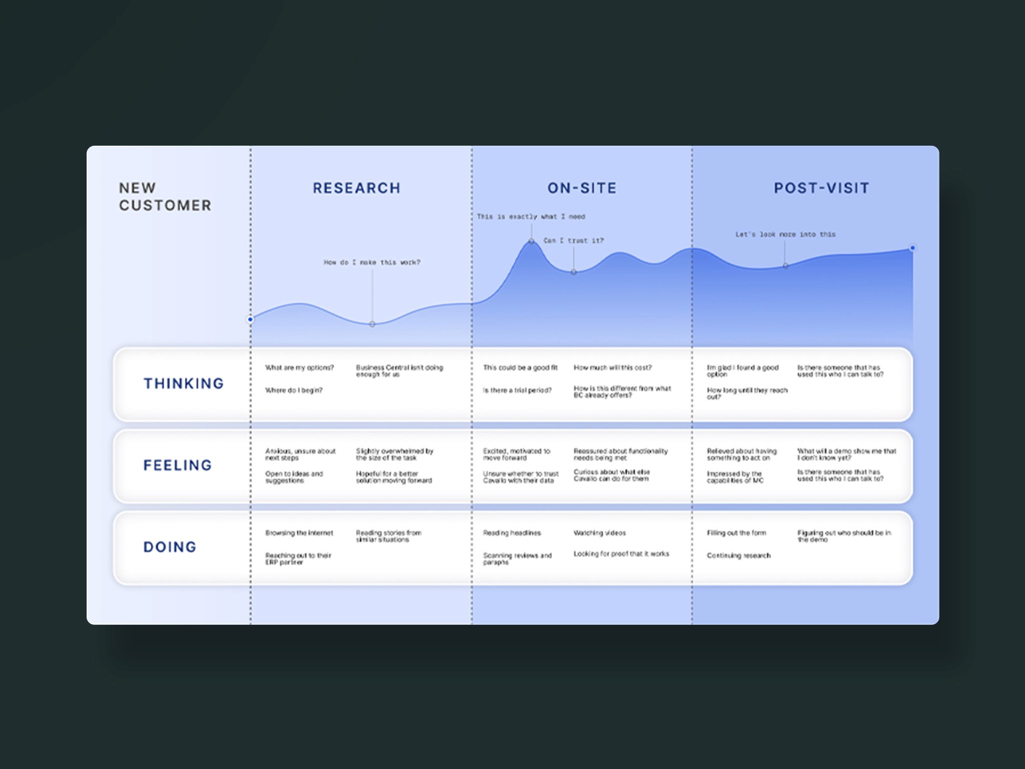
The process began with stakeholder interviews across both internal (marketing and product teams) and external (users) stakeholders. These sessions revealed a key insight: the existing site didn't allow users to self-educate effectively before contacting Sales. That finding shaped the foundation for the redesign strategy. To supplement these insights, I conducted competitive research, reviewing high-performing B2B SaaS websites in similar industries to identify best practices for conversion rate optimization (CRO). This uncovered opportunities to strengthen differentiation, improve content hierarchy, and maximize self-education opportunities for users.
Getting Dug In
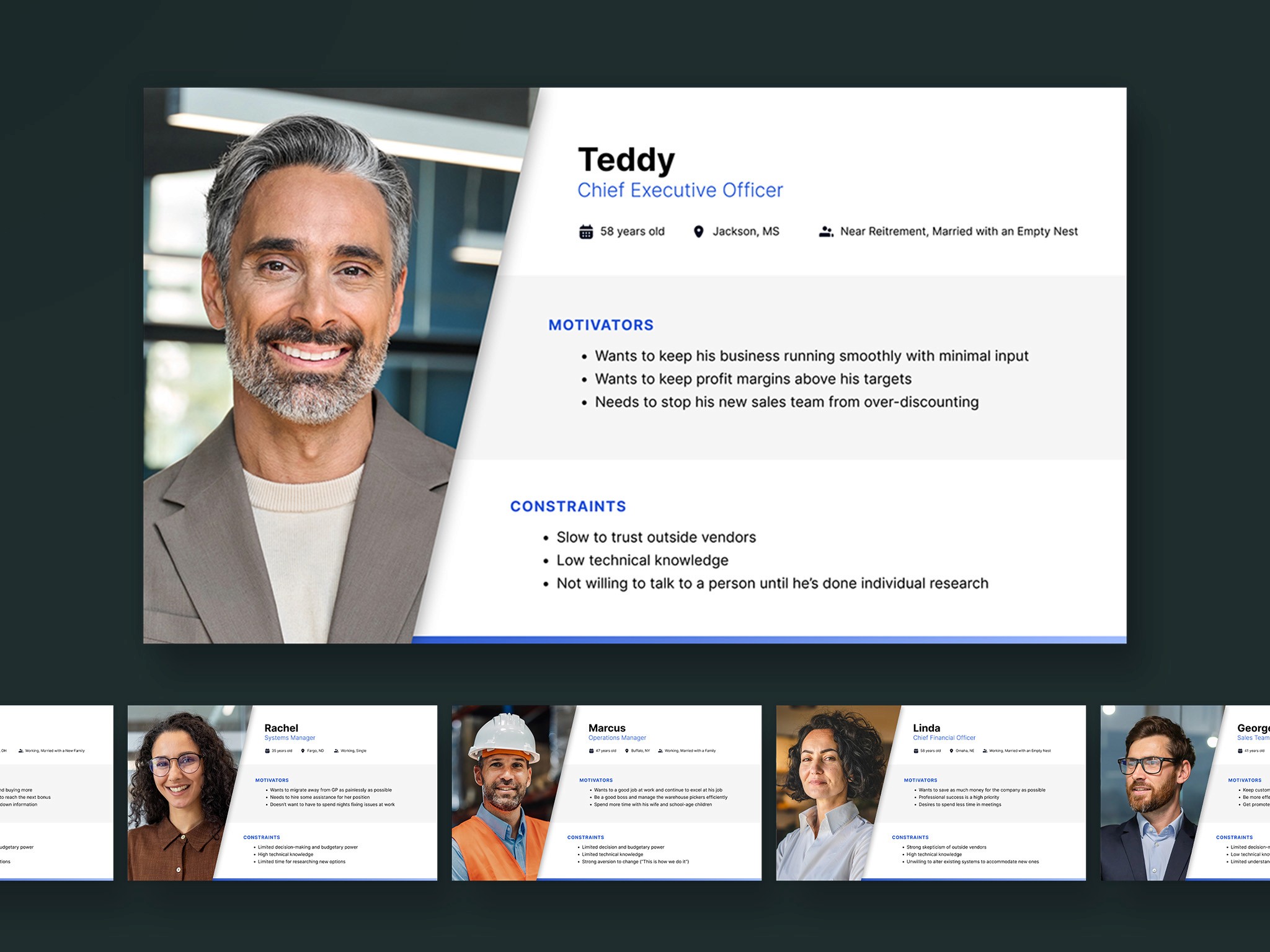
Using data from the stakeholder interviews and the company's own professed ICP, I created six detailed personas representing distinct user segments. Each persona captured motivations, challenges, and behavioral drivers, helping to align both content strategy and interface design with user goals.
I then developed user flow diagrams to map how visitors would ideally navigate the site, from initial awareness through to conversion. This helped explore what user might find useful or be looking for, revealed possible pitfalls, and gave further insight into the mental and emotional states of users as they interact with the site.
Defining the Architecture
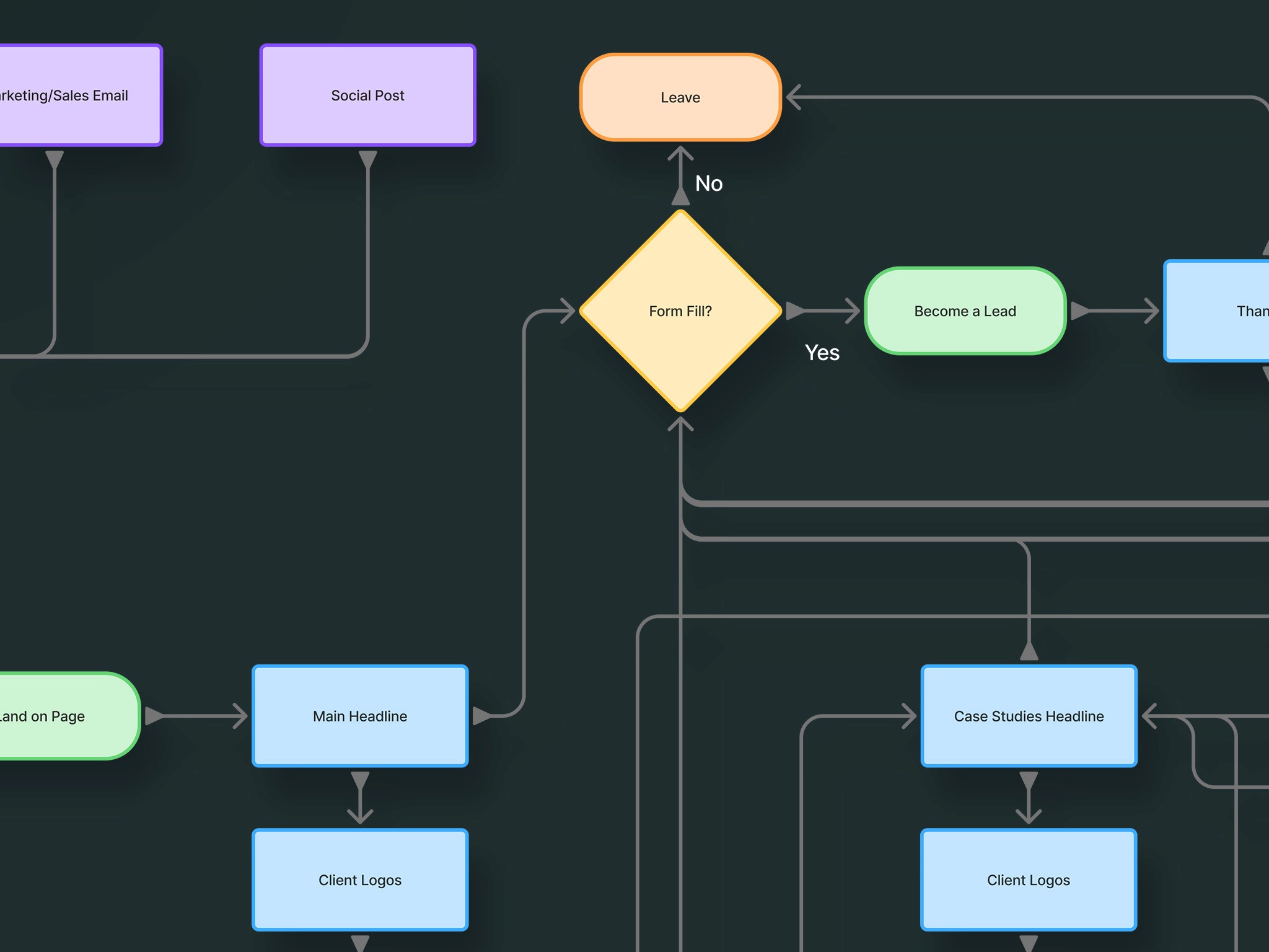
I developed user flow diagrams to map how visitors would navigate the site, from initial awareness through to form submission. This clarified the site structure, defining what pages and content were necessary and what was extraneous bulk. It also informed the navigation process and how content and CTAs could guide users toward desired outcomes with minimal friction.
From Idea to Artifact
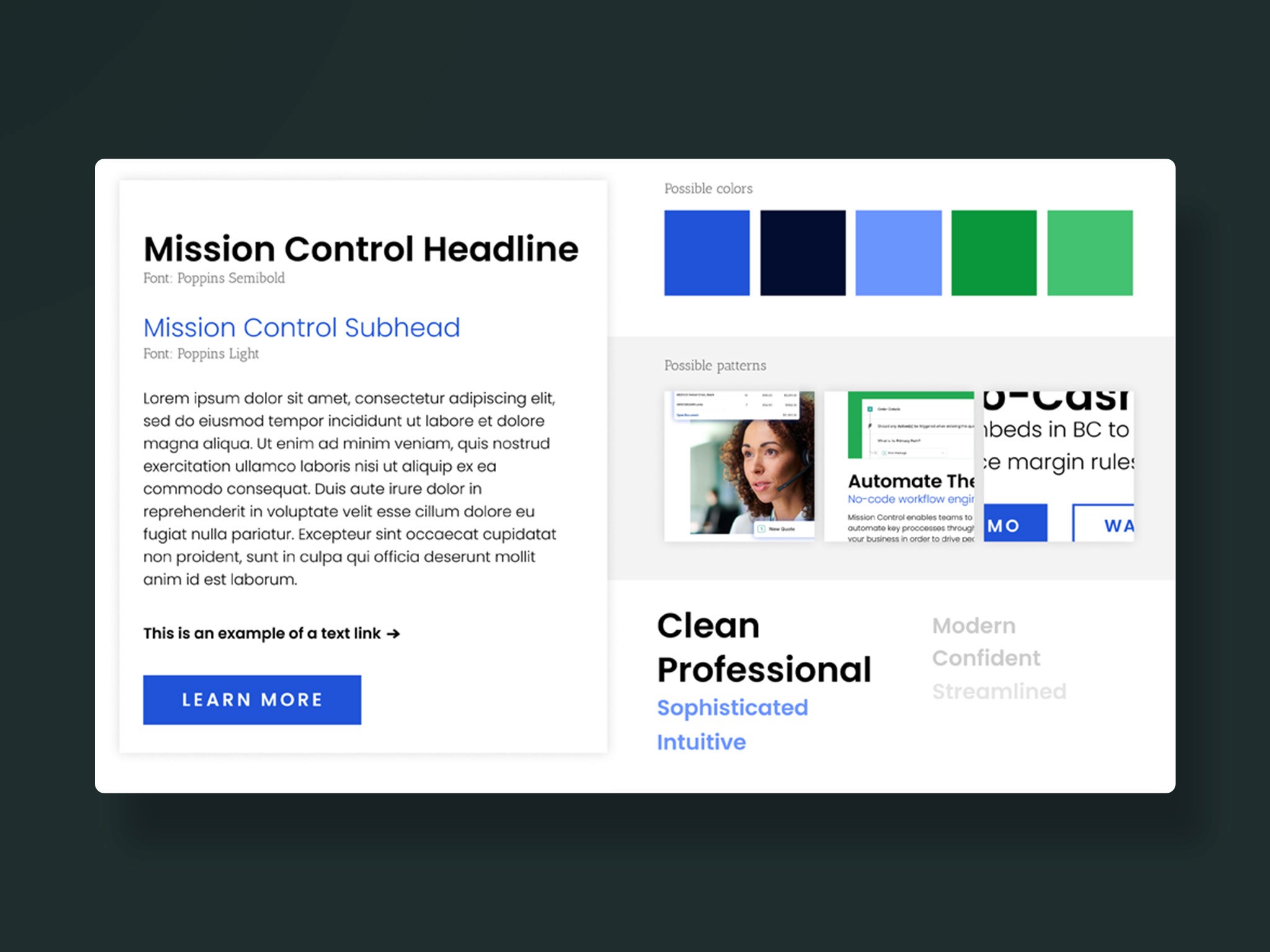
I began the process of wireframing and developing a visual identity for the site. Drawing inspiration from the client's existing brand, the audience that we had defined, and existing high-performers in the online space, I established a visual system that communicated trust, energy, and innovation to users.
Unfortunately at this point, the project was cancelled due to external factors at the client's business and I was never able to bring this site through to high-fidelity and publishing.